 •
07/25/2016
•
07/25/2016
Kris LaFavor is the founder of DesignAhead. In addition, Kris is Heart of the Customer’s go-to designer for all of our journey maps (she also designed our website, so we’re big fans!). In this post, Kris lays out her guidelines to make sure our maps have that visual impact that is so critical to driving customer-focused change.
Before you start designing your map, you have to approach the design process from the point of view of the customer whose journey you’re mapping. To do this, you have to understand the research your map will be based on. This research is your window into the customer’s thoughts and emotions, so dig deep and ask a lot of questions to understand the premise and goals of the research before you begin your design process.
Rather than the team just emailing the ideas to me, we typically get the entire team together for a half-day workshop to distill the findings down. By listening to the team, I get a feel for what’s important, which allows me to anticipate what is important to the customer.
Look at your research and decide where the moments of truth are in the customer’s journey—what are the really important, make-or-break moments? Finding these points won’t just help you better understand the customer—they are essential to creating something of high value for your client. In order to create an informative, visually compelling map, you have to create differentiated levels of importance, to both capture the eye and to impart the most important parts of the journey to your reader. If everything is at the same level of importance, then nothing is important—there needs to be a hierarchy of information.
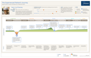
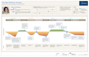
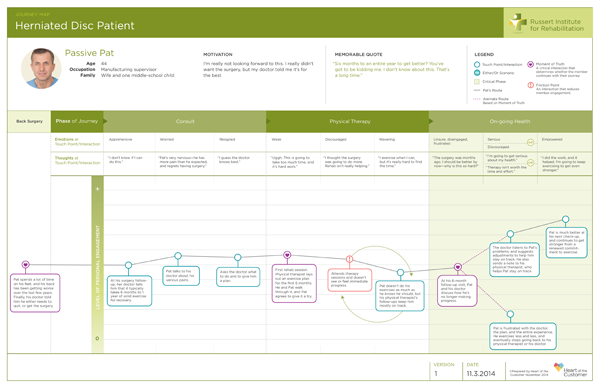
Meridian Maps Caption: In the set of Customer Journey Maps for Meridian Health, the most salient information to highlight was the distinctly different journey for each persona in the Actions portion of the maps. Notice how Stanley’s is generally very positive, outside of dealing with insurance in the beginning. Contrast that with Holly’s who needs to be in control. She likes the first part of the journey, where she’s in charge – but all control is lost once she enters the hospital grounds. Finally, since Natalie is less experienced, she is overwhelmed by the journey, but enjoys the friendly Meridian staff.
The use of gradients inside the up or down curves from the baseline gives the viewer an immediate overview of these differences. Additionally, the Friction Points and Moments of Truth along the route gave Meridian insights as to where they could make changes in their process to better serve their patients—and sometimes—where they were doing things right.
Find something that will make the journey “stick” in the reader’s mind. The point of a journey map is to impart information in a unique and memorable way, so make sure the reader will remember the customer’s journey and its most important parts. We want to capture not only readers’ minds but their hearts—and usually the “stickiest” part of a journey map will be the emotional touchpoints. After all, that’s what we make decisions based on, even decisions on what to buy and spend money on—emotion. So find the parts of the journey that will “stick,” and make sure they end up in your map. Even more important, ensure that the eye is pulled here first.
We spend a lot of time discussing where the eye should go when you first view the map.
What color scheme are you using for your map? What images are you using? Are you mapping the journey from left to right? Top to bottom?
Here’s where the idea of a hierarchy comes back, in the visuals of your map. Use the company’s brand colors as a guide for your color scheme, but within that make use of color theory to guide your use of color. Always keep an eye on the readability of the map—don’t put a lot of light text on a dark background, for example, and keep in mind simple guidelines, like that bolder colors will draw the eye whereas more muted shades will let the eyes rest.
And don’t be afraid to use images and icons—we look at pictures before we look at words, and journey maps are meant to give a lot of information in a quick, simple way, so use images to give your reader information at a glance. Make sure you’re telling that story graphically, using iconography and imagery.
Don’t incorporate graphics for cosmetic purposes only. Everything on the map needs to be there for a reason—to further the understanding of a specific journey. At a glance, people should be able to see the touchpoints on the map. Within 5 seconds they should be able to grasp the high-level story. The point of a journey map is to understand the customer’s journey, and if it’s too complex or cluttered, readers will give up before they can understand what you’re trying to tell them. Distill the complexity down until it can be read and understood quickly and accurately. At the same time, reward continued study. While we want the high-level story to be evident within 5 seconds, readers should discover more the more time they spend with the map.
For over 20 years, Kris has helped mission-driven companies and nonprofit organizations define and build their brands, create awareness, and improve the customer experience. Beginning with a thorough understanding of strategic groundwork, Kris crafts graphic identities, customer journey maps and info graphics, digital and traditional communications, and initiative brands. Often working with cross-functional teams, Kris applies her passion for design excellence and technical know-how to create ideas that will grow with her clients as they expand and prosper.