 This is a journey map rant. It’s time we stopped calling employee workshops, Post-It Notes charts and PowerPoint and Visio documents customer journey maps. And we need to realize that design matters.
I recently read an article on journey mapping. It had some good points, but ugly maps. Then I hit a sentence that stopped me altogether:
Focus less on how pretty it is, and more on how valuable it is. Inevitably, someone from design will see this project and want to jump up in there. Suddenly, the conversation will turn to legends, color codes, formatting, and more. Avoid the rabbit whole [sic] that is visualizations and bring it back to the data. If you have valuable data, the visualization is just a vehicle for the valuable story.
“Just a vehicle?” Clearly, this author doesn’t understand that design is part of what makes a journey map effective. Although I knew that the moment I saw his maps. It’s not just about data. It’s about telling your customer’s story in an effective way. And you can’t do that with ugly maps.
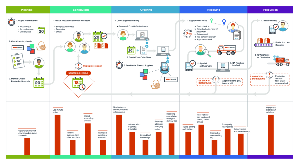
Unfortunately, there’s plenty of confusion around journey maps. We’ve allowed the term “journey map” to mean whatever we want it to mean. Some bring employees into a room, give them some Post-It Notes, and call that a journey map (I’m looking at you, Oracle. That’s not a journey map. That’s an ecosystem map – they’re different). Others seem to think that it’s about just collecting your customer’s steps and tossing them into a spreadsheet. Or maybe we can throw together a bunch of bubbles call that a journey map.
It was this last group that led me to develop our journey mapping program. Another firm hired me to create a journey map in their template, and that’s what it was – a PowerPoint slide with some rows and bubbles. That’s not a journey map. That’s [redacted].
So, if none of these are journey maps, what is?
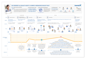
A journey map is a visual way to tell your customer’s story as they see it. It shows the good, the bad and the ugly – opportunities where customers are engaged, moments of truth where engagement happens or doesn’t, and friction points where they’re getting frustrated. And you need to present your story in such a way that everybody from your CEO to your line employees can read it without training.
There certainly isn’t one “right” design for a map. Ours vary depending on our customer’s brand and the story we need to tell. I’ve posted a couple of journey map examples we’ve used before. On the top right is another format developed by Design Ahead that’s worked out really well for us. Good maps vary. But they are always designed, and they always stem from your customers’ view.
So let’s be specific. Are we creating journey maps, ecosystem maps, or [redacted]?

